
If your product is different from others within the same category or it even creates a new category, you have some good cards to play.
But, if you cannot communicate it clearly through packaging and if the consumer (and, before him, the buyer) does not see a very clear difference between yours and the other products, you will lose the game with some great cards.
Good cards, bad game!
Unfortunately, the content of the box counts very little if it is not opened and, usually, the consumer does not get to open the box for 2 reasons:
→ the product fails to enter into distribution (not found on the shelves because the purchasing department does not display it)
→ the product is not noticeable and does not communicate its uniqueness, so it remains anonymous (this is different, but packaging does not communicate)
At this point, we can have a nice chat pulling out everything that is wrong in today’s market, distribution, in the role of purchasing departments and many other beautiful things, but, in the end, they are only words.
What we need, instead, is a functional and measurable solution so that the consumer:
– Chooses your product
– Opens the box
– And, finally, discovers the difference between yours and other products
It is a reflection that we can apply to any product category. In fact, on the shelves, there are too many items, and as you can see, in the supermarkets, there is no room to welcome new items!
For this reason, it is increasingly difficult to get noticed by the consumer (if you are already into distribution) or to enter into distribution by motivating the purchasing department (if you have a new product) .
How to get into distribution with a new product if today’s market is now objectively saturated?
One solution is, definitely, in packaging and, today, I want to talk to you about it taking advantage of one of our case studies.
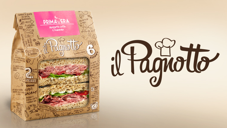
A few months ago, when the company Parma Is came to us, they had the need to launch a new product that stood in the freshest section: the association with long-lasting sandwiches in the fresh sector was the most logical natural connection, but, at the same time, a connection to avoid.
By analyzing the characteristics of the product and the target market, the data obtained made it clear three conditions to be met for the success of the product:
1. To place it in the freshet category (unlike the common sandwiches that are currently on the market and have a longer sell-by date)
2 . To move away from any association with the concept of sandwich
3 . To clearly communicate the concept of “super-stuffing”, a characteristic feature of a homemade sandwich and that is not present in any type of product on the market.
How did we work on product naming and packaging?
PRODUCT NAMING
For the success of the product, it was vital NOT to be perceived as an item associated to the sandwich concept. In fact, the sandwich category is already saturated and it would have been impossible to convince purchasing departments to get a new item. Due to this, every creative solution that would evoke the sandwich concept and its name was banned.
Moving on “Pagnotto” enabled us to emphasize naturalness, richness and goodness of the product, highlighting these issues and making them evident from both the choice of the name and the characteristics of the logo. In fact, these characteristics are consistent with a genuine product – the real strength of the Pagnotto.
A functional naming allowed us to emphasize the distinctive aspects of the product and to move away from the field any association with other existing products, actually opening the doors of large scale distribution stores, by creating a new product category away from the sandwich concept.
PACKAGING
Material → using a crude paper bag helped to emphasize the analogy with the genuine product bought at the corner shop, creating a clear difference with the classic sandwich wrapped in plastic.
Graphics → we took advantage of the entire bag surface with a texture capable of expressing characteristic features of the product such as its origin, dual filling and the use of typical Italian products.
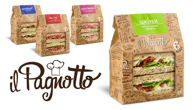
Specifications → the front window offers a direct contact with the product and with its filling (true differentiating aspect), while the colorful adhesive strip, used to close the package, allows to immediately distinguish the item through the use of six different colors, corresponding to each of the 6 Pagnotto’s toppings.
Inside, a twin plastic pack separating the 2 Pagnotti and making them visible through the front window. This last aspect – the window views of the product – is vital to the packaging of many products and we will discuss it in detail in a dedicated post.
Again, we started with a deep analysis of the product and of its target market, trying to understand customer’s needs and, then, providing accurate answers through packaging.
It also was of a great value the research we conducted in Anglo markets, where ready-to-go sandwiches have a large presence in freshest sections of most famous retail chains and coffee shops.
What is wanted and required by the end consumer and what was missing on the market was the starting point; how to communicate it best through packaging was a logical response.
We did not have to wait long to see results coming in! The Pagnotto easily found its place on the shelves of major chains such as Carrefour, Conad and Feltrinelli Bar.
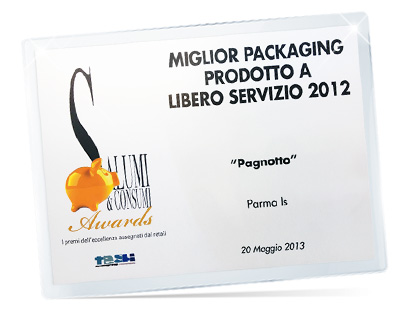
Insiders have quickly given attention to the product, with the double recognition achieved at Tutto Food 2013, winning the award for Best Packaging and Best Product Innovation.
Are you wondering how we could emphasize the uniqueness and distinctiveness of your product? Contact us to find out how we can help you.
Post Correlati:

In 1996 enters in the world of marketing, in 1999 founded Ardigia Marketing Funzionale (Ardigia Functional Marketing), in 2013 founded Packaging in Italy, Design Agency for Packaging Positioning™
Antonio
Ho avuto modo di vedere il prodotto a Tutto Food
e di vederlo nell’azienda di produzione
Mi complimento per l’innovazione non disgiunto a quelle
che devono essere comunque le costanti di qualsiasi prodottol food..
qualita’ e gusto
Michele Bondani
Ciao Antonio,
certo è esattamente quello che ho scritto, il prodotto è fondamentale e nel caso del pagnotto oltre ad essere veramente buono (io lo mangio spesso) è anche unico nella sua categoria, rischiava se non avesse avuto la giusta comunicazione, di non arrivare nemmeno dal buyer.
Per questo ritengo fondamentale aver chiarito questo aspetto per i prodotti eccellenti e innovativi che molto spesso non trovano spazio fra gli scaffali per colpa di un packaging che li penalizza!
chietor
http://www.italiafruit.net/DettaglioNews.aspx?IdNews=23717
Ma una parola su questo packaging? Se fossi il Pagnotto sarei leggermente incazzato…
Michele Bondani
Adesso provo a chiedere…