
Are there dead retail sectors from the communication point of view?
I mean, are there any sectors where it is difficult to add something through the packaging (structure, message and design)?
I definitely believe there are NOT. (Watch this video)
[leadplayer_vid id=”528B45865970A”]
In fact, every time someone talks about a type of product where there is very little to say or do, I see the best possibilities, perhaps because, while others are convinced that there is no different alternative from standard and aesthetic codes consolidated over time , I wake up and look for more functional solutions.
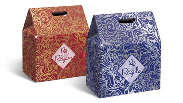
That’s what happened with Italtrade, the Italian leading company in the production of Christmas baskets and gifts* (strenna, in Italian language). We talk about a very special sector, a real niche, with precise rules.
In other occasions, we talked about festivity products and their characteristics related to their stay (very short) on the shelves. These rules also apply in this circumstance, with the difference that a company that produces Christmas gifts, since it provides different product categories (panettone, nougat, champagne and other Italian festivity products ) has the duty to clearly differentiate itself from its competitors, because it cannot take advantage of the fact of having a single brand known by the consumer.
* Christmas gift or strenna is a gift that is usually received or given at Christmas time.
This practice comes from the ancient Roman tradition which consisted on the exchange of greeting gifts, during the Saturnalia, a series of festivities that took place from December 17th to December 23rd, in honor of the god Saturn, preceding the day of the Natalis Solis Invicti. The term derives from the Latin term “strēna”, a word probably of Sabine origin, with the meaning of “gift of good luck”.
How to make the consumer to clearly recognize the product?
Our reflection took off from this starting point.
I admit, we were not completely new in this sector. Actually, the restyling and positioning that kept us busy from 2008 to 2012 with other players and that allowed us to develop specific skills related to Christmas baskets and gifts – obtaining, in that case, also a remarkable return in terms of market volumes – means that, today, in this industry, our agency does make a difference.
The challenge that we faced this time with Italtrade was even more ambitious.
How could the packaging structure, message (including naming) and visual position a new product in the Christmas gifts sector?
The company had a clear intention to innovate by investing in packaging and our response was not long in coming.
This is what we did:
1. Structural elements
We needed a characteristic element for the structure and we found what we were looking in the scroll. A customized scroll represented a novelty. In this way, the scroll is applied to the gift and is removable after the purchase.
Christmas presents are in fact purchased as gifts and making the gift more valuable is everyone’s purpose. That is why stripping away the scroll from the gift, after the purchase, represents an absolute novelty on today’s market and it is also functional to consumer’s needs.
Outside the store, all technical details, barcode and any packaging information linking the product to a large retail concept disappear. The result? It gives prestige and value to the gift.
There is also a logistics advantage associated with the use of the scroll. Traditional Christmas gifts containing information that refers to a specific festivity (Christmas), once back in the warehouse as an unsold product, can no longer be reused. Instead, those gifts using the scroll, with all the information posted on the removable band, provide the gift with a precious valuable texture, worthy of an important gift.
That is why developing and patenting® the scroll for Italtrade was a crucial step.
![]()
2. Naming
The concept of “gift” is the soul of a Christmas present. Giving it prominence and a prestigious characteristic allows the product to stand out in response to consumer’s question: “Am I buying a gift of value?”. Or more simply said “Will I make a good impression?”. The name “King Gift”, simply and directly, identifies the gift as the most prestigious one among those present on the shelf, automatically becoming the choice on which to focus.
3. Visual
Being a Start-Up Brand, the word “King” was crucial and we studied it to take advantage of an image already existent in the consumer’s mind, already seen, an experience already lived in the unconscious, the King indeed. This is why the idea of focusing on “The Transfer of Sensations” and using just the visual that was evoked in a natural way.
The King of Dal Negro playing cards was perfect (well-known to anyone who likes many international symbols) and inserting it into the visual would helped evoke, also in the mind of the consumer, the same association.
Innovation was the soul of this work. It seemed that everything had already been said, yet a different perspective allowed us to rework the structure, visual and naming in a non very conventional way, without losing sight of the main goal: to communicate with the consumer to generate sales on the shelves.
When Christmas gets closer we will see the result on the shelves. In the meantime, if you want to understand what the packaging of your products might say, also (and especially) in the event that everything has already been said in your field, contact us.
READ THE COMPLETE TESTIMONY
In 1996 enters in the world of marketing, in 1999 founded Ardigia Marketing Funzionale (Ardigia Functional Marketing), in 2013 founded Packaging in Italy, Design Agency for Packaging Positioning™