
During these last years I have realized Packaging Positioning for any kind of products and that is a lucky thing because it gave me the chance to grow professionally, discover aspects from behind the scenes and appreciate the true story of Companies that otherwise I wouldn’t never understand.
When I first met Mr Diego Romanini – meeting finalized to the developing of the Packaging Positioning towards a new corporate image for the occasion confectionery – he shared with us some information acquired by the focus group and that were precedently developed in order to analyze the Paluani’s brand perception of the customers.
After a deep evaluation of those analysys and of the brand itself, we understood that basically there were two aspects we needed to re-launch the Paluani’s brand:
A Packaging Positioning of Jack Trout’s School

At this stage our job started as usual with a deep analysys about who, in the market, was operating in that segment. That’s why we have literally screened with the X-rays the historicity, the packagings and the marketing of all players in the market.
This work has been made before theorize any idea. In facts only after we analyzed the scenario in which the Paluani’s products would have make their moves we could have spotted the angle to point to. Only one attack angle, different comparing the one used by the competitiors would have allowed us to communicate in an effective way.
You must define a different attack angle compared to your competition? CLICK HERE →
The attack angles to communicate through the packaging
This way it has been a logic process the one that drove us to identify the strongest points to use in our Packaging Positioning, and at the end we have focused on 2 key elements, to bound in the best way possible to the Paluani’s brand
- Genuine and healthy products
- Italian products
And after that, other 3 points having a fewer relevance, bu fundamental indeed for the good success of the project and that could not be missed – they would have been the further elements to communicate through the package.
- Elegance
- Occasion (Christmas)
- Historicity
We said that these aspects, 2 in particular, had the responsability to re-position the competitiors and it was about a concept of healthy product and genuine Italian.
The aim was to make Paluani to become the “healthy” alternative in the occasion confectionery and it is on this track that we have worked.
The target of Packaging Positioning ( Jack Trout’s School) is exactly this, summarize in one Packaging Master those elements in a visual way, in order to sell the product without and assisted sale on the shelf.
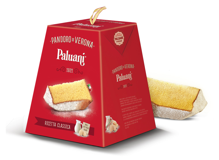
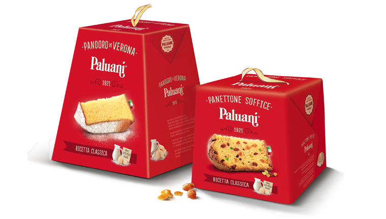
Pandoro Paluani, re-think to the packaging towards the merged points
The first reflexion was about the Paluani corporate color, the red, often utilized in Chrstmas time, but already used by another competitor brand. Change it radically would haev been risky, so we better preferred to operate on the structural design.
The Pandoro package has been completely changed by using a customized structure that would allow to work also on the sensation transferts; initially we proposed a more risky shape and even more differentiating, but successively we have reached the right compromise. The shape, the form is for sure one of the most distinguishing feature and more evident of the new Paluani’s Packaging Positioning.
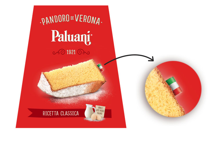
From a graphic point of view the extreme purity and a minimal approach characterize the front part of the package. The visual elements are few and well studied, starting from the Pandoro slice in close-up that recall the Italianity with the tri-colour of our flag. This element has a strong importance over the whole package, without being invasive. It is exactly there that associating it to the product visual, we make clear to the consumer the concept of “Healthy and Italian” product.
The chosen lettering for the product name highlights the presence of the good old time pastry shop, that leaning over the Paluani’s brand name reinforce the concept of “Healthy as it once did”.
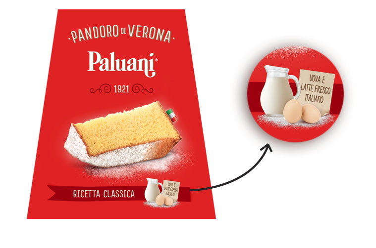
Apart the Pandoro slice in close-up on the front, a second visual element is present on the package and is it a recall to “genuinity” of the ingredients by the use of an image that shows eggs and fresh italian milk.
In the rear part of the package we developed a good pictogram that reinforce the historicity and the tradition bound to the Paluani’s brand. It does it revamping the historical graphics of reference “Old Paluani Pastry of Verona 1921”. This way it gives no doubts and it is the sensation trasnfer that we needed to close the game.
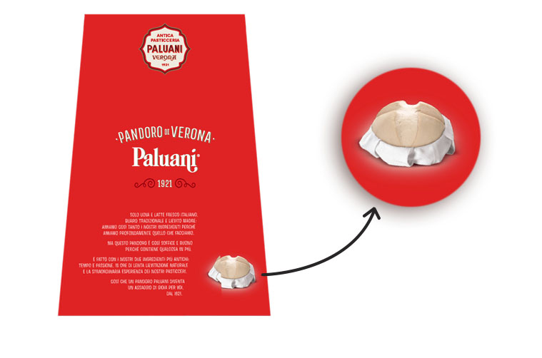
The concept of Healthy and Genuine product is trasmitted also on the back of the package, by the text and visual of the sourdough.
Not an easy operation, to tie up 2 plus 3 elements in one only package, but before that, to spot them among such a competitive market. As you can see the key elements seems to be an ensemble, they are highlighted without prejudicing the purity, teh semplicity and the Elegance of the new packaging, adn this is exactly how to develop a Packaging Positioning Trout’s school.
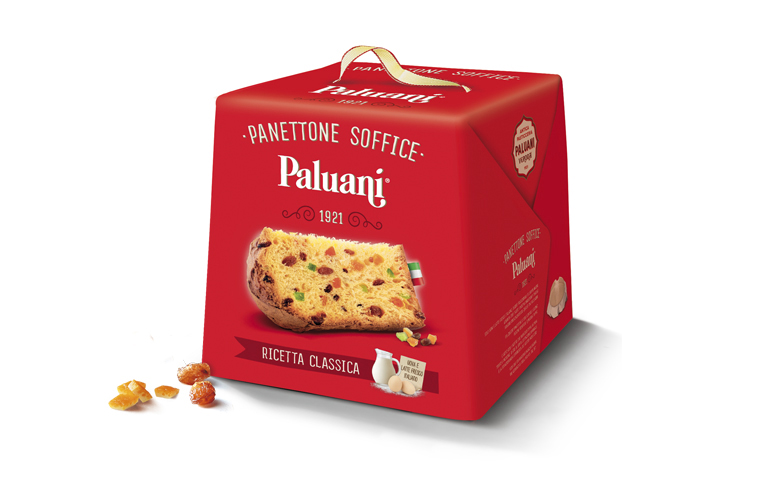
Paluani’s Panettone
Together at the Pandoro we have also worked on the Panettone, to make the packaging a powerful marketing instrument.
At this stage there were some elements of continuity to reinforce the brand identity ( Lettering, corporate colour, etc.)
On the front we have used the visual elements bound to the eggs and milk.
The position of the slice – this time a Panettone one – has used the same room of the front package and also by the use of this reply of the graphic scheme it has given a contribution to the identity of the brand.
There were many qualities and characteristics that we could communicate and you will understand that a product like this one is rich of aspects that could be transmitted. But our analysis showed us the path to walk and the key features on which be focused. Give space to others would have been counterproductive.
2M Euro in 20 days with the Packaging Positioning
The world of occasion confectionery gives no mercy, if you make a mistake you will be hurt, in facts almost the 87% of your working efforts are concentrated in about 20 days of sales on the shelves. As usual the results are the ones that gives the final response, and the market rewarded the new choices developed with Packaging Positioning for Paluani, showing a +40% of sales that allowed them to gain the 1,3% of segment quote.
Read the witness of Diego Romanini, CEO of Paluani S.p.A.
This study case represent in full the attributes of our agency: to make Positioning ain’t easy, it depends by many factors. The one that often is under estimated by many, is the true knowledge of the sector in which you have to operate, the importance of the various brand players and their perception in that sector, so distrust at all the oracle distributing suggestions; a positioning cannot be made in 4 hours
I am sure that if it would be the open menthality and the courage from the major brands in every market, in granting one only expert consulent in making their positioning, we would not see positioning overlap in the same shelf.
Do you want to position in a distinctive and effective way your products in the market? Call us for a first consulting.
In 1996 enters in the world of marketing, in 1999 founded Ardigia Marketing Funzionale (Ardigia Functional Marketing), in 2013 founded Packaging in Italy, Design Agency for Packaging Positioning™