
When a company links its name to a specific product category we say the company “owns the category.”
This occurs when saying the name of the company we automatically think about that category, and vice versa.
We can find a very clear example in the energy drinks market. It is automatic to think of the brand that “gives you wings”. Another product that can automatically be associated to a brand is the raw ham. Associating it with the Parma Ham crown is the most natural thing – even though, technically, we speak of the Consortium and not of a corporate brand, however the concept follows the same dynamics.
In today’s case study, we can clearly see the mechanisms that I have just described. When we think of the category of the Provolone cheese, a brand above all the others finds space in the consumer’s mind: Auricchio. In this article I want to talk to you about a recent project that Packaging In Italy conducted for Gennaro Auricchio S.p.a.
I feel like sharing this information to show you how from this side of the desk we approached a globally well known company that preserves its distinctive features, remaining focused on clear objectives and repositioning it on the market as the absolute leader within the category.
When I first encounter Alberto Auricchio and the marketing management team, we focused our meeting on one particular product: the Provolone half-moon cut. For the company, it is one of the leading products with the highest sales in large distribution channels. The need that emerged was immediately clear: to increase the gap with respect to followers (the distance between Auricchio’s half-moon and competitors) through a restyling.
Even for a well positioned brand like this, all the competitors belonging to the same niche market (sweet and spicy provolone half-moons weighting 200 to 300 grs.) were becoming a potential problem and to rethink its position on the point of sale was a must.
We knew this was a delicate and ambitious mission and this is why we immediately started to work to identify the most suitable solution.
The starting point of our restyling
Abbiamo iniziato analizzando i dati dei focus group svolti in due città campione, Milano e Bari.
We started by analyzing the data obtained from focus groups conducted in two sample cities, Milan and Bari. Our starting point was the consumer. We wanted to understand exactly what he perceived from the current half-moon image and what was not clear or perceived as a lack.
With this information, we obtained an accurate picture of the consumer’s vision. In particular, we discovered that:
– Auricchio’s half-moons were easy to get lost among others of the same size offered by competitors
– The dairy tradition of the Auricchio family did not emerge.
– The 100%-Italian product concept did not emerge.
– The provolone cheese concept did not emerge.
This result gave us useful and precise information to develop our task. We then continued analyzing the alternatives the market offered: the competitors.
The next step was a detailed analysis of competitors offering “half-moons”, taking into consideration also private labels ones, which – for the volumes they generate – are the most important antagonists. This step allowed us to understand where competitors were placed and how we had to address our positioning.
By observing all the brands in the same market niche within the large scale distribution a first real weakness emerged: the packaging of our client did not communicate uniqueness despite having all the elements to do so.
In fact, Auricchio, back in 1877, first created the provolone cheese category, in Italy and in the world! In Italy and in the world, Auricchio is THE Provolone and there should not be any doubts about this point to the consumer’s eyes, and we had to communicate it.
4 Fundamental Concepts to communicate guided us towards a solution
1 Auricchio’s historicity, the first in the Provolone category
2 The Auricchio brand
3 The Auricchio family dairy tradition
4 Italian product
We know that all packaging communicates with the consumer, so we wondered …
You are interested in the cost of a redesign of your packaging? CLICK HERE →
How to translate these 4 concepts into a single visual?
The first step was crucial; it makes up to 80% of the visual impact of the packaging.
The real position of the corporation, the magic ingredient was the addition the image of the provolone.
If the first point was clearly identified, the second had yet to be developed.
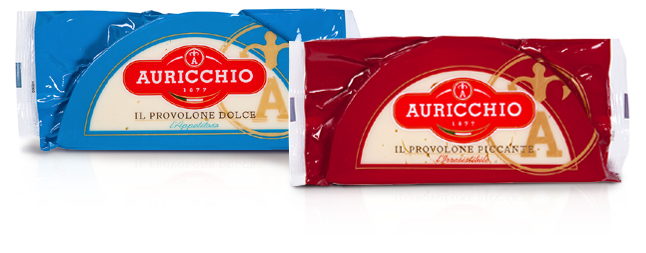
Each brand focuses its communication efforts in the logo, and I must admit that getting our hands on the Auricchio logo was not an easy task at all. This logo had been on the market since 1877 and it was the result of a number of changes along the years. In our opinion, some significant changes could yet be implemented to help communicate the brand in a stronger way, making it recognizable in no time.
![]()
We got to this conclusion starting from the provolone presentation. The logo that we found on the provolone is the one that gives visibility to the company: a step back helped us to make five forwards.
![]()
Having successfully developed the first two points, we realized that they were also part of the other two points: the visual image conveyed the Auricchio family dairy tradition and also the Italian concept and, therefore, the development of the new logo.
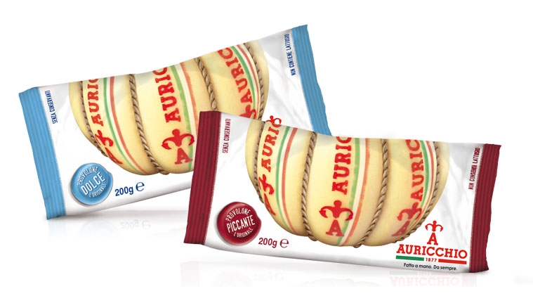
We decided to include a picture of the provolone on the packaging to create an instant visual association between the shelf product (the 300g half-moon) and the provolone shape, which creates in the mind of the consumer the concept of historicity and tradition.
The shape of the Provolone Auricchio makes a direct reference to the historical product and to how it was sold, as it used to be.
Finally, on the front of the pack, a flag reminder helped to emphasize the Italian concept – important in both foreign and local markets. The clean design helped to synthesize these concepts.
What you see in the picture is the end result of our work, recently available in supermarkets.
A major and rewarding challenge to which we dedicated the essence of the philosophy of Packaging In Italy: a packaging with genetic profit, focused on generating sales!
In 1996 enters in the world of marketing, in 1999 founded Ardigia Marketing Funzionale (Ardigia Functional Marketing), in 2013 founded Packaging in Italy, Design Agency for Packaging Positioning™