
What is rebranding?
For rebranding we mean the process of marketing which brings to a partial or total change of the brand identity.
It is not just about the renewal of the visual communication of the brand through the logo, the colors or the packaging, but it is a much more complex work that concerns the perception of the brand, with its values and with the quality of the products or services which are offered.
The companies which require to use the rebranding always have a reason: repositioning their brand.
Everybody has got the purpose to communicate to the audience the new image, the new identity and the new values of the brand and, consequently, it will change how they will be perceived.
It is in this way a strategic operation for the company.
Why is it so important, for big and small companies, making rebranding?
5 reasons to make a rebranding.
- Retaking quotes of the market
- The brand is weak and/or little distinctive
- Eliminating a negative image of the brand
- Modifying the positioning
- A change which requires the evolution of the brand
For the brands it is fundamental to determinate not just the right time to do it, but decide which elements have to be changed and which elements have to remain unchanged.
The history is full of examples of famous rebranding. Let’s see together some of them:
![]()
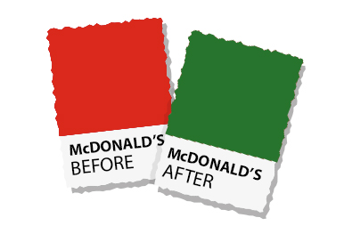
1- McDONALD’S
One of the most famous examples is McDonald’s.
Initially the success of the company was due to a fast and standardized service able to satisfy the need of the consumers.
During the years, thanks to the franchising, the sales network of McDonald’s has been expanded in a short time in the whole United States and subsequently all over the word.
Over time, however, the image of the company to the eyes of the consumers is radically changed.
Between the late ‘90s and the new millennium the brand McDonald’s was perceived as a low-cost fast food chain, with poor and unhealthy food, what today is commonly defined junk food.
Bad reputation that got worse and worse after the release of the documentary SuperSizeMe, written, conducted and interpreted by Morgan Spurlock.
After the publication of this movie the image of the brand, which was already compromised, reached historical lows. It was the time of a changing. The necessity of the company was to relocate itself in the eyes of the consumers. It was necessary a real activity of rebranding which brought some drastic changes.
The first of all is about the colors that turn itself from red to green.
But are we sure it has been a completely successful operation?
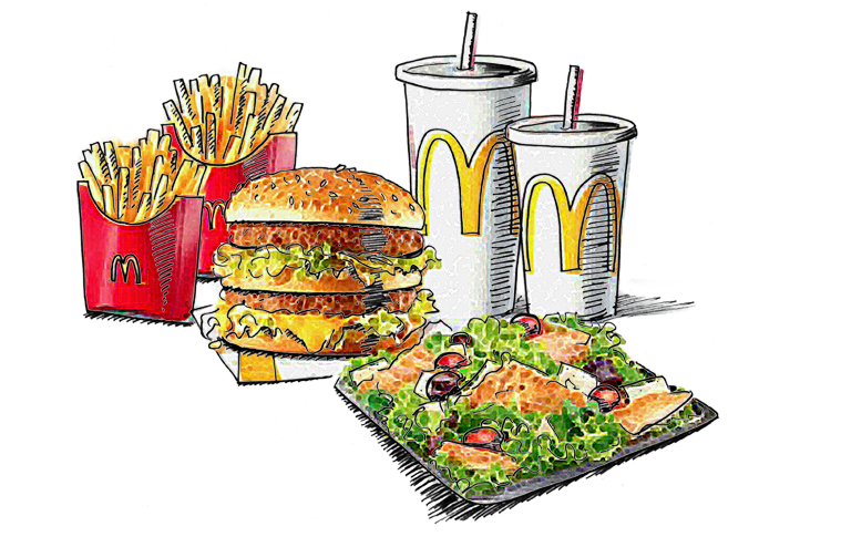
Try to close your eyes thinking about French fries, drink, cheeseburger and to all coordinate image of McDonald’s. What comes to your mind?
But the two most important questions to wonder to which you could try to answer, are the following ones:
- Has the consumer really perceived this changing?
- Has the McDonald’s rebranding obtained the desired positioning?
In addition there were some important changings about the menu with the introduction of healthy and fresh food as salad, but they had a gear change thanks to the co-branding with handcrafted local companies that has been appreciated by the consumers.
During the years it was revised the aspect of the stores in order to transmit to the consumers a cleaner, healthy and elegant image.
In this way McDonald’s tried to raise its brand identity perceptions to the eyes of the consumers.
As you see it is not always necessary modify the logo, image and colors.
If you want to review the image of your company contact us without any commitment!
The revolution and revisiting of the Nissan Brand
We can’t define just a simple rebranding what Nissan did in 1986, this case deserves to be deepened. Not everybody knows that the automotive company Nissan not only modified the logo, but it even changed the name: initially indeed it was called Datsun.
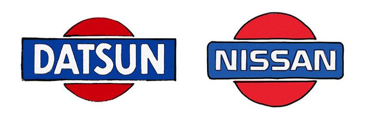
Datsun era l’acronimo delle iniziali dei fondatori e la parola sun, che indica “sol levante”.
Datsun was the acronym of the initials of the founders and the word sun which indicates sunrise.
The historical brand of the Datsun (written “DATSUN” on a blue background, in front of red rising sun in white field, symbol of Japan) became the base for the Nissan brand.
Actually Nissan the abbreviation of Nihon Sangyo, the holding of which the company belonged.
With the campaign “the name is Nissan” the new naming and the new logo were introduced to the world. They were easier to remember.
The goal of this operation was to make the name Nissan recognized and recalled by the customers as much as the historical rivals Toyota and Honda.
The variation of the naming is a big changing for any brand (of big and small dimensions) and for most of the entrepreneurs. But, for most of the times, it is a winning, necessary and fundamental step to ensure to your company a rosy and prosperous future.
Obviously it is not an operation that has to be done with too much ease, but it has to be studied and planned in any details and entrusted to highly qualified professionals.
If you are not quite sure yet on how to make your rebranding contact us!
Do you need a Corporate Identity and you want to know the cost?
Do you need a Rebranding and you want to know the cost?
How much does the restyling of your old packaging cost?
In 1996 enters in the world of marketing, in 1999 founded Ardigia Marketing Funzionale (Ardigia Functional Marketing), in 2013 founded Packaging in Italy, Design Agency for Packaging Positioning™