
The Packaging Positioning masterpiece is accomplished,
Yesterday for the Beatles, Once upon a time in America for Sergio Leone, the Gioconda for Leonardo or Maradona’s goal against England in the 1986 world championship, the same thing happened for me with this Brand Positioning, Product Positioning and Packaging Positioning starting from the new name Opificio Emiliano.
As you well know, the most effective system for selling your products and making your competition packaging harmless is Packaging Positioning, but the truth is that not all positioning are the same, there are some that you understand you’ve done almost a miracle, perhaps because they are developed in more difficult sectors with more competitiveness, in absolute the case study of today is part of this category. In this positioning everything has been revolutionized, in a sector where everything has already been said, where for years companies with big brands invest hundreds and hundreds of millions of euro / dollars in communication, in our case, we did not have this possibility, we had a limited budget that has been fully exploited in marketing.
New Naming
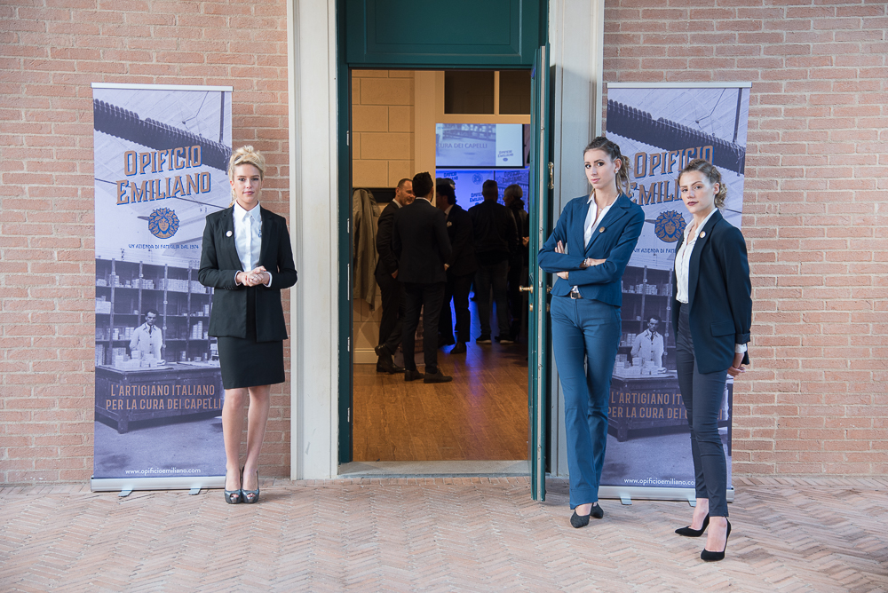
“Opificio Emiliano”, is a totally new brand, created from scratch for the Debel company, specialized in the professional hair care sector since 1974; our agency was in charge to identify and understand what space was still available inside the salon to take a new position in this category. This assignment had to fit into the features and DNA of the Debel company, in order to create a storydoing as well as a storytelling.
![]()
Why Opificio
The meaning of Opificio derives from the Latin word opificium, intended as a workplace, a factory or an industrial plant within which the transformation of a material into a finished product takes place. The term, however, over time has taken on a broader meaning, that of a workplace where any work activity takes place. Today there are different types, such as industrial, artisan, goldsmith, textile, etc.
In our case, the real reason to identify the name Opificio is due to its synonym, started from a parallel research about the word “laboratory“, this unusual name, with this intentionally “ancient” terminology, stimulates the curiosity of whoever approaches this word for the first time and does not know its intrinsic meaning, to make it unique and immediately mnemonic.
Indeed, the name “Opificio” is very centered with our positioning, that is: the historical, small and artisan workshop of the province that reproposes the old authentic recipes (of herbal medicine or of Galenic medicine), revisited in the trichological world and in a modern and contemporary way. High quality formulas certified by advanced scientific research.
Comparing with another completely different category, that one of confectionery, the word “opificio” could be compared to that of “offellelleria” which is a synonym of confectionery, a word not very common in the past and today used by several companies in the sweet food category and now of common use. Our choice is about “Opificio” exactly to be the first to own this type of name and positioning in the trichological category.
Opificio communicates:
- Artisanal laboratory
- Revisited tradition
- Authentic quality
- Certified formulas
Why Emiliano
The second part of the name is the word “Emiliano”, deliberately wrote down in male gender because it comes after the word Opificio (a male name): it’s unequivocally the link with the Italian region. It has been chosen to reinforce our positioning and to geolocalize the place where the Debel company was born and belongs. Emiliano communicates the concreteness and the credibility of the Italian industry and work world.
Emilia means a great industrial history. A lot of companies started as a family affair, by passions and small artisans such as in the world of engines (Ferrari, Lamborghini, Maserati, Pagani, Ducati, etc.). Emilia means the industries which are the worldwide top class in the food category (Barilla, Mutti, Parmalat, Granarolo, Casa Modena, Fini, Prosciutto di Parma, Parmigiano Reggiano, etc.), means fashion factory (Max Mara, Pinko, Liu Jo, etc.).
Emilia communicates the idea of economical and industrial wealth, the history of the Italian industry, this region has always allowed the people who live there to improve. Developing wealth, new ideas and new projects. Emilia means extreme culture, both peasant, genuine, true, pure values of family and undoubtedly also those of academic circles, literature, journalism, politics, up to the musical one, in short, a land full of values and history.
The word “Emiliano” helps and greatly facilitates the memory of the word “Opificio”, much more complicated and not so common as the latter.
Emiliano communicates:
- Place of origin
- Geographical area
- Concreteness
- Credibility
- Genuineness
Our positioning considers 3 fundamental aspects of the marketplace:
- What Debel has made until today
- What Debel represents in the marketplace
- How are and what represent all the competitors of the category
Being aware that the greatest volumes and revenues in this sector are made in hair care and color, we have chosen the playing field that was already in the history and vocal cords of Debel, which is the hair care.
Brand Positioning
The positioning developed for Debel, as always, was born starting by an accurate competition analysis, in this case in the trichological world, subsequently to find a differentiation in this category.
Considering that this type of sector is extremely crowded compared to many others, finding a differentiation in a world where practically everything has already been argued (almost) and finding a free position with a new naming available at the beginning of 2019, with the possibility of an online and off-line registration was the goal and the miracle I was talking about. The new brand name Opificio Emiliano has been identified and conceived.
This name is composed of two words that are certainly not standard and uncommon in the hair care sector; have been deliberately sought in this way, in order to convey and reinforce our positioning towards the competition.
Communicate the strengths and skills of the company, such as the historicity, the family management, the specialization and the craftsmanship of the product. For this reason, a new Brand Positioning was created at the high end of the market, through the identification of this new name, “Opificio Emiliano”.
In a market that is divided into three types of companies: those that want to appear “cool, fashion and sophisticated”, those that focus everything on the “naturalness of products” and finally the followers with me too products. Summarizing the analysis, there are three macro areas depending on this category:
1.Big brands that can be positioned by seniority / historicity.
2.Brands that have found a fair segment in the natural, anticipating the times compared to most players, or others late have focused on a single storytelling, investing considerable budgets for communication, thus arriving first in the mind of the consumer with a “natural” product.
3.The third segment is the “no brand”, those that do not have a positioning and that have only a me too product, copying those big brands that have already arrived in the consumer’s mind and in the salon, which in doing so will never have their positioning, but they will reinforce the leading brands.
The right way to become a brand is to talk to the consumer world, for this reason all the strategy we have adopted in our image and communication, is addressed first of all to the final consumer to increase visibility and sell-out within the B2B retail world.
Opificio Emiliano, with his vintage design, has been able to be different from all the competitors. The new graphic design is unequivocally inspired by a post second world war style revisiting the Liberty style in a contemporary but absolutely new interpretation in this sector.
The positioning to find, must be intuitive, simple, fast and easy to understand, beyond the naming, so I want to give you some examples of positioning with these characteristics to arrive at the positioning of the Opificio Emiliano.
Google Positioning is:
Search Engine = Google / Google = Search Engine
The Mission of Google is:
“Organize information worldwide and make it universally accessible and useful to all users”
Amazon Positioning is:
Online purchases = Amazon / Amazon = Online purchases
Amazon’s Mission is:
“Being the most customer-centric company in the world, where people can find and discover whatever they want to buy online, for absolute customer care”
The positioning of Opificio Emiliano is:
The Italian craftsman in hair care = Opificio Emiliano
Opificio Emiliano = The Italian craftsman in hair care
Opificio Emiliano’s mission is:
“An Italian family company, specialized in the hair care research for professional salons, with only 100% natural Italian products”.
Payoff
The new brand name is accompanied by a payoff that completes the corporate positioning.
– A family company since 1974 –
Opificio Emiliano is perceived as a more artisanal and concrete company, it also allows us to exploit in storytelling the ancient recipes with 100% Italian natural active ingredients, all revisited in a contemporary way, high quality formulas, specialized in hair care research, aimed at the beauty, well-being and uniqueness of each individual consumer; enhancing and protecting the professional role of hairdressers, concretely helping the business and professional growth of salons, going beyond the natural. The natural is now an element inflated and taken for most market customers and Opificio Emiliano, going to the other way, differentiated itself from all the market players.
“A family company since 1974” increases our differentiation.
Our Payoff not only differentiates us from the three macro “segments” into our category, but says that we are small, concrete and that we already have a story that we want to maintain over time.
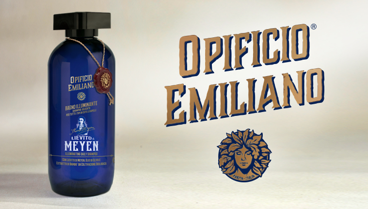
Logo
The new corporate logo is characterized by the image of the head of a muse whose hair is replaced by a thick development of leaves to symbolize the use of natural, strong and suitable for growth products.
Product Positioning
If the first positioning is about the company, the second one is about the product. After months of research, where I personally lived hours, days and months, side by side with the Key Man of the Debel company, the General Manager Marco Cabrini, we identified, clearly together, that it was not enough to have a Brand Positioning, but we also needed a product differentiation, to have a stronger storytelling on our first sale, to our first customer, the salon. Then being able to communicate effectively with the consumer.
“I recommend any manager or entrepreneur who wants to be a winner on the market to take advantage of Packaging in Italy consultancy.”
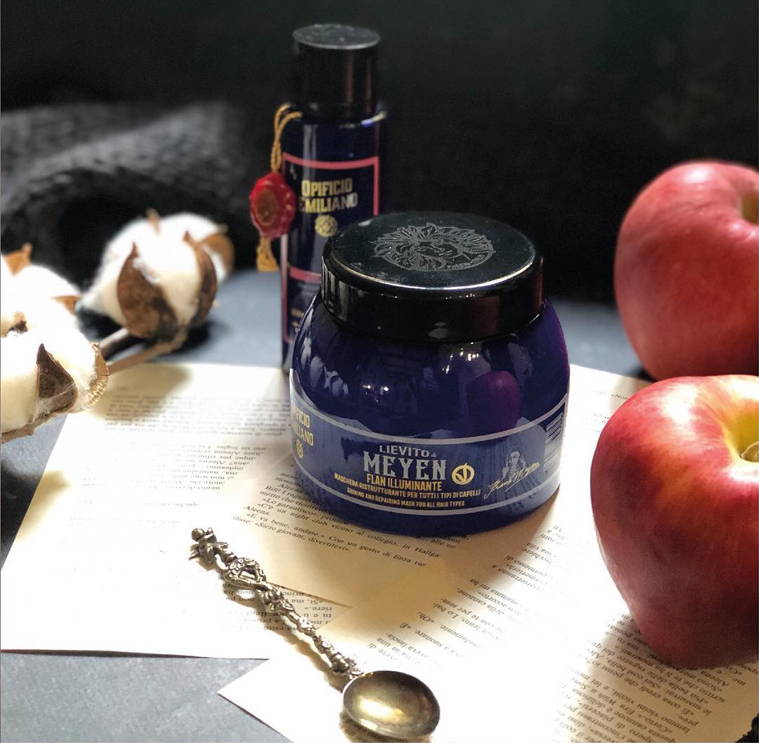
Thus, after several weeks of comparisons, research and meetings, a beautiful morning at the end of March, the idea comes, the intuition of being able to insert a yeast inside our product, for all the lines; this is how the differentiating element on the market was born, the magical element, called “Meyen’s Yeast”.
Why Meyen Yeast
- We identified Saccharomyces probably the most important yeast in human nutrition, exploited the element and the word “yeast” because it transmits the benefit in hair care, moreover a new and innovative idea in the hair care category.
- The intuition to include the scientific aspect and not stop at the leaven alone was immediate. The simplest idea was to use the scientific name of the product, but it was unpronounceable, so we thought of the scientist who had discovered this yeast and it is from here that the second part of the naming “Meyen” was born.
Also in this case it was created, in addition, a new naming, then the development of a new logo with the words “Meyen Yeast” which is accompanied by the stylized image of “Franz Meyen”, the German botanist who discovered the responsible active ingredient of leavening and from which derives the name of the differentiating ingredient.
Target
The buying habits in the salon have changed a lot in recent years due to greater attention to exposure and the layout of the store. This evolution is the effect of greater attention and awareness by the hairdressers, but one thing is certain, in most cases, the same operator inside the salon is not yet prepared for an assisted sale, not transmitting to the consumer the true value of the proposal that lies in personalization, knowledge, experience and high professionalism of the salon.
Therefore the salons have gradually changed in the exposure, towards a packaging modality to promote the product itself almost in autonomy. The enormous competitiveness of the various players in this field (which is increased dramatically in the last twenty years), confuse consumers even more in the salon because they communicate more or less all the same things.
We consider that a fundamental aspect of Packaging Positioning is that the Packaging must communicate to the consumer world (B2C), therefore the more the language is simple, not technical and the more it will be functional to the sale of the product. The more it is “basic”, logical, intuitive and the more it is perceived as the right product for the customer.
The real secret of Packaging Positioning is this, starting with a communication and a new project in 2018, in a super-crowded market like that of trichology, we had to create a different positioning and able to communicate to the consumer world.
Packaging Positioning
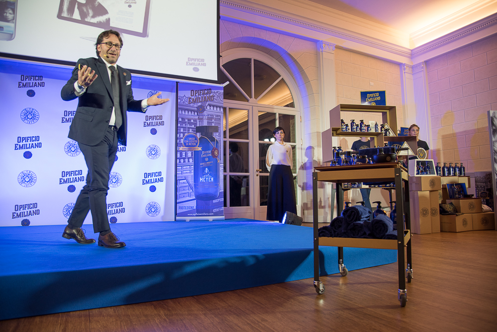
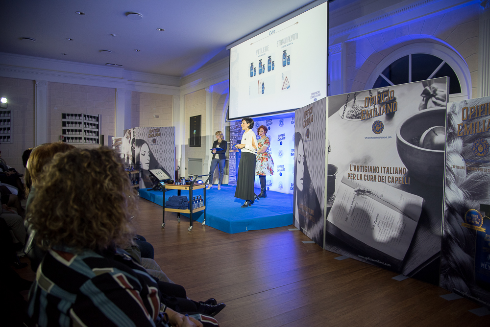
For the Packaging Positioning it is very important to communicate the differentiation on the packaging. In the particular case of Opificio Emiliano, we started with a “Corporate” positioning to develop it on the packaging of existing lines today, in the Debel family, and in new products to complete the range.
To better understand the steps and the concept of Packaging Positioning, today the extension of the Brand Positioning on the package is considered, as Jack Trout, the father of the positioning, said and wrote. All Positioning differentiation rules have been applied on the packaging itself, the main difference is that the Brand Positioning can be communicated and explained in various ways: textually, verbally, with videos, brochures, websites, etc., while Packaging Positioning has only one way, the packaging, and that is the only occasion he has to sell the product, designed without an assisted sale and to help the salon sales.
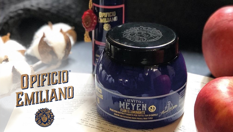
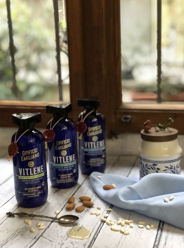
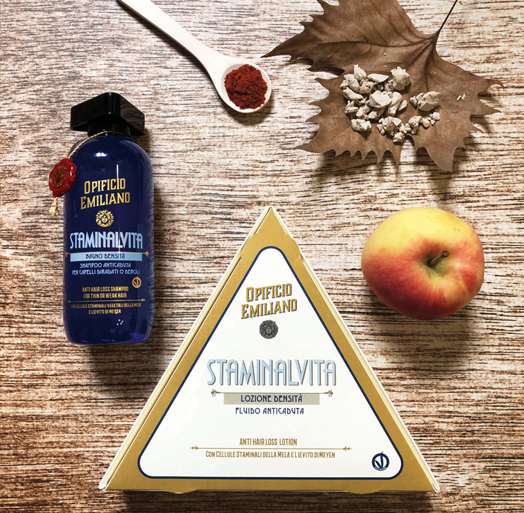
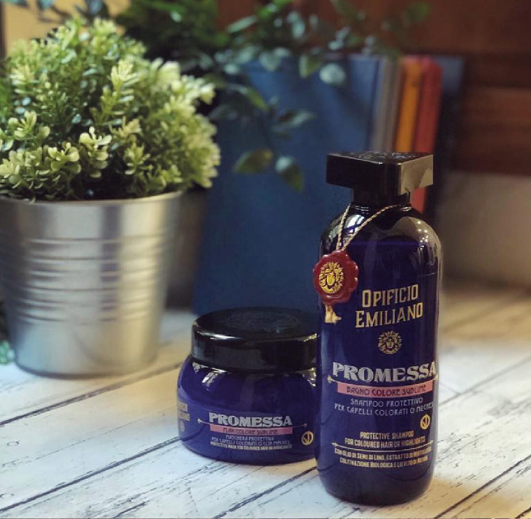
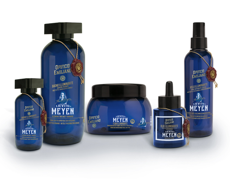
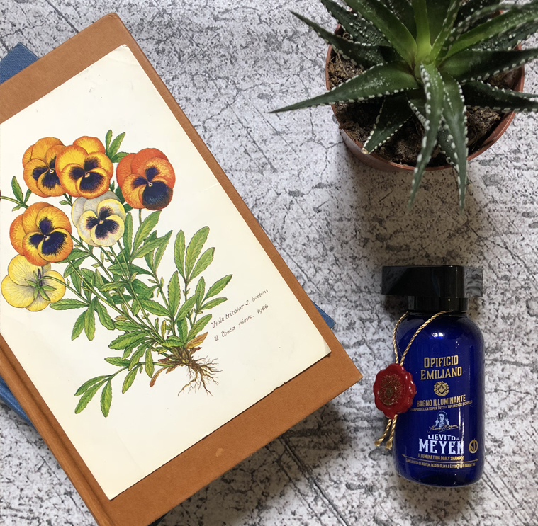
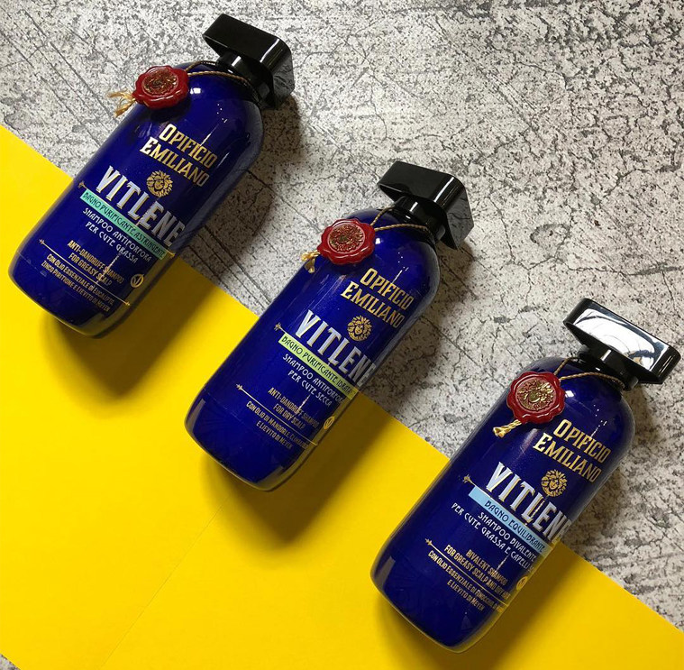
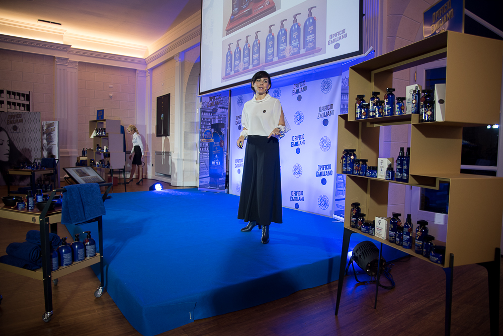
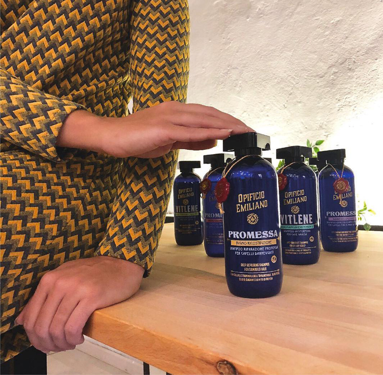
We have identified a blue color for the bottles and of the whole product line, the graphic design represents an innovation for the sector, so in the same way for the structural cap, we have developed and strongly wanted a dedicated mold.
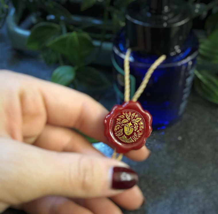
We have placed a quality assurance seal on the whole bottle line that simulates the old and historic sealing wax attached to a golden cord, which transfers the guarantee and quality of the product to the consumer.

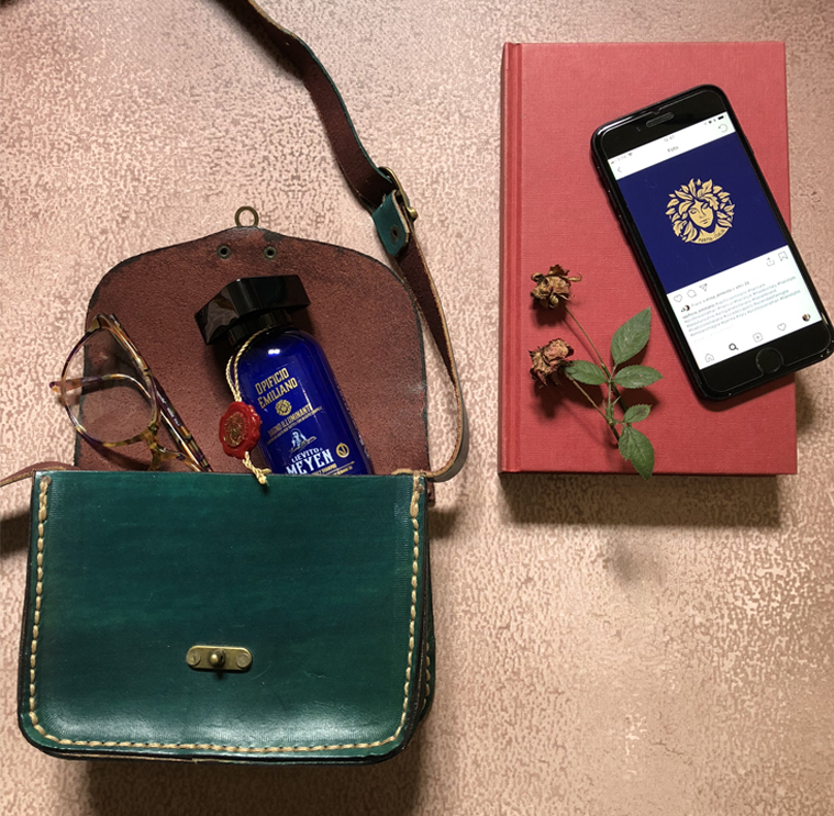
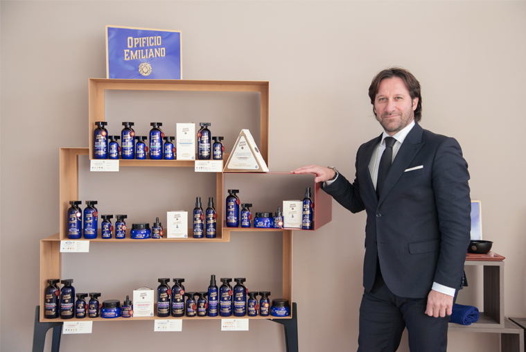
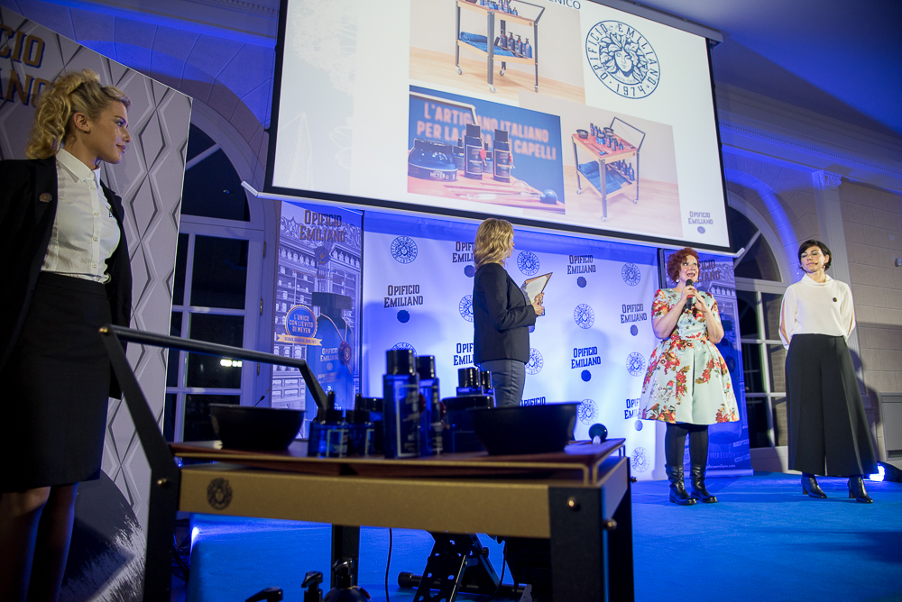
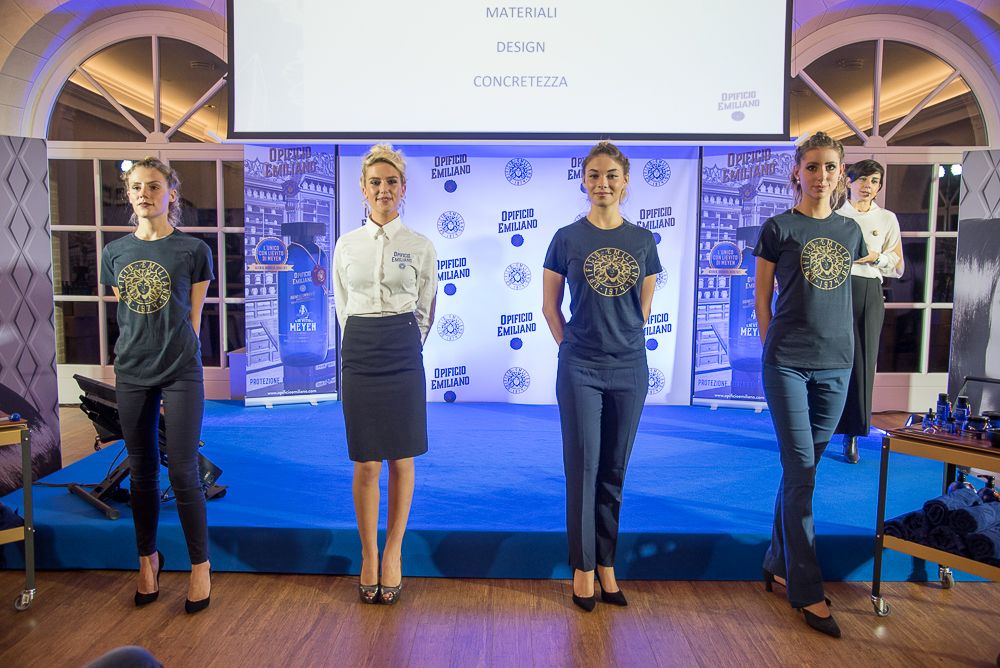
The research, the identification of all the words and the lettering used on the packages come from a careful study of the details to be able to convey the historical period of the Brand Opificio Emiliano. The project and the creation of the new brand image, engaged the whole agency in the creation of the packages of the different types of products, such as shampoos, conditioners, lacquers, hair masks, coloring products, coordinating all the support materials, brochures, websites, stationery, agent cases, etc.
There are three aspects that we must understand and evaluate in the packaging that we have developed and that have been the basis of the Packaging Positioning of the Opificio Emiliano:
1.NAMING E LOGOTYPE A fundamental aspect of the Packaging Positioning research was certainly to identify a Brand Name and subsequently develop it into an extremely original logo. We have moved from a very crowded playing field in a new, more restricted category; we are the first to communicate in a vintage, artisanal and provincial way, the small family business that was born in 1974. Opificio Emiliano is positioned in the opposite way to all the players.
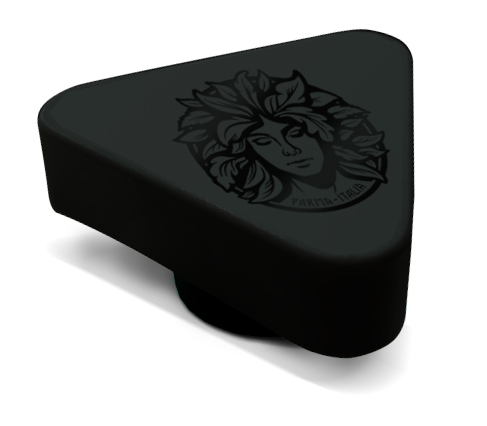
2.STRUCTURAL DESIGN It is our uniqueness. We have tried to safeguard the originality of the structural design of the packaging, we have designed an original mold, with a unique cap on the market in the reference sector: black triangular, with our “muse” logo engraved on the top. A cap that is representative and characterizing compared to all other competitors, with a unique shape that brings the transfer of sensation back to the vintage mood of the 50s / 70s that reflects our brand.
In addition, this special and unique structural design also includes a wax seal with a hot-gold seal with product certification. All this serves to increase the perception of quality craftsmanship, of great value, positioning the product not only in a treatment and care but also at a self-rewarding level for the consumer and gift.
3.COLOR Our goal was to achieve the identification of an original color compared to the standards already seen on the market, for example the amber color is very used by most players. The important thing was to find, in the same category, a color that could allow us to strengthen our “vintage” positioning. The Bleu Reflex color, alongside the black and gold that we find in our logo, not only characterizes us, but also makes us a Premium Price and Quality Price product.
Concept Store
If we rewind the tape at the beginning of this post, I wanted to call this case study the “masterpiece” of Packaging Positioning, saying that not all positioning cases are the same, and it’s true, there are some that are more precise, more complete, which for a series of coincidences become perfect. The example is exactly this, a company with historicity but that launches a new brand as if it were a startup, develops its business in B2B but is forced to talk to the B2C world within the retail market. Do you understand how many things need to be considered for the development of this project? But understand equally clearly the opportunities that are in this Brand Positioning.
By now, a known aspect of Packaging Positioning, is that today it commands on the Brand Image, before I arrived on the web to make the “rumor” it was unthinkable and heretic to say these things, today there is evidence that what I am saying is absolutely true. But the Packaging Positioning has no limits, precisely because it starts from the Brand Positioning, therefore when the customer requires it, it is possible to also work to the Concept Store.
We have followed and coordinated the development of the Concept Store in several cases (Es: Gourmerì, Roll Eat), as in this case, before starting to think about the development of the product you need to know where it will be sold, this is not a detail. The store appearance today, more than ever, becomes a fundamental and powerful tool to amplify the Brand Positioning.
For this reason, together with Debel, we have carried out a deep research, we have followed fairs, studied the various salons, we have tried to understand the different choices that determine the final result inside the store to develop our concept store, from the counter, the exhibitors, furniture, seating for cutting, chair-washing sessions, furniture, even floors, lighting and perfumes, our analysis was complete, examined what competitors were doing on the market, identifying solutions consistent with the brand Opificio Emiliano.
In this case, as you have seen, our contribution went far beyond a simple packaging job, here it was a question of launching a business from scratch and dealing with all the choices that would have affected the opinion of the consumer and in the case of a product sold through a network of stores, the retail image also becomes essential.
The cherry on the cake
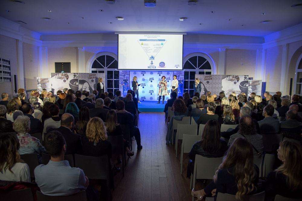
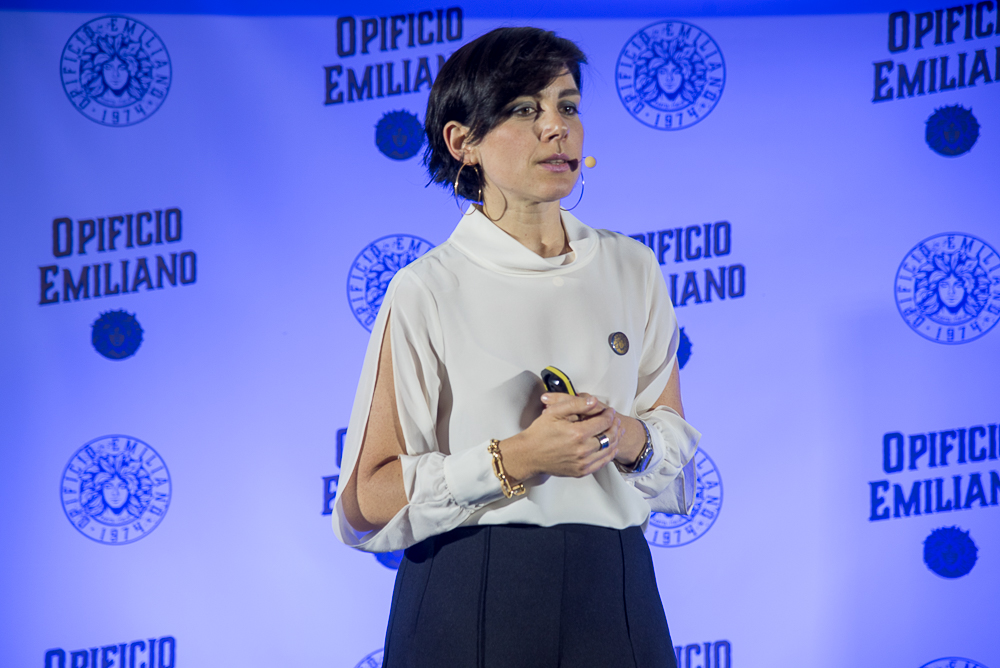
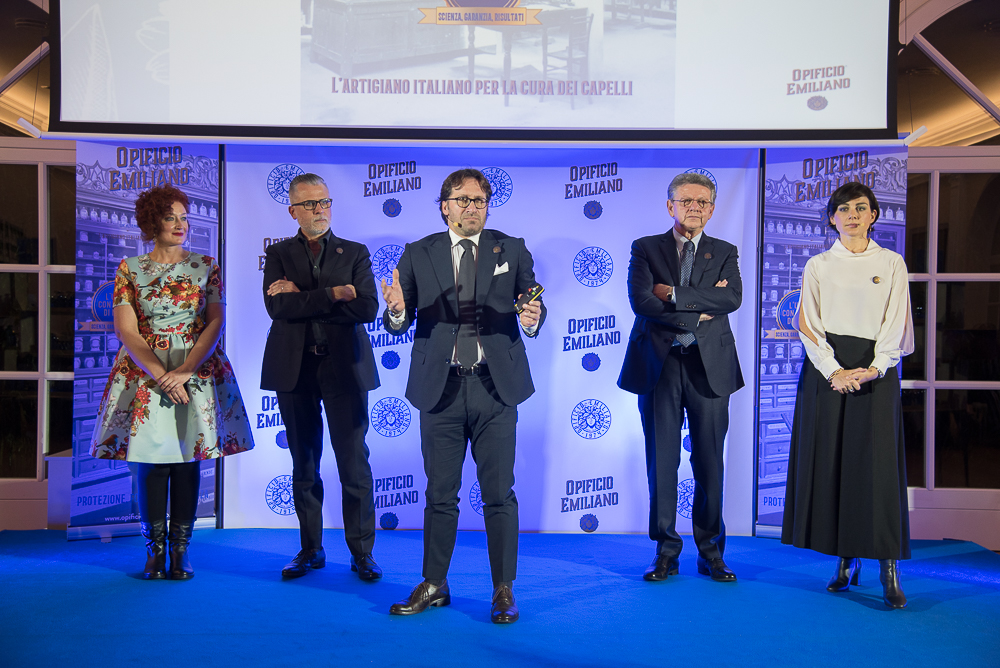
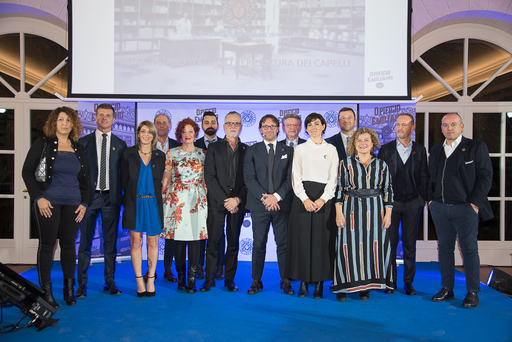
Every year, as Jack Trout’s sole affiliate and partner for Italy, I have the duty and also the honor to share real case studies with my associates. This year I presented the Opificio Emiliano case study (November 2018) in Dubai, in front of the global Gota of Trout & Partners – Global Leaders in Strategic Positioning, all my partners were not only complimented me for the excellent strategic development but asked to be able to share this case study worldwide with all non-present partners.
As you well know, I am not a huge fan of creative prizes for their own sake, Packaging in Italy has won and participated in several Awards,
I am convinced that in addition to being a winner on the market, this project will be successful in other environments, stay tuned.
Want to know what we could do to help you launch your business idea on the market? Contact us for a first cognitive call, we will be happy to help you reach your goal.
In 1996 enters in the world of marketing, in 1999 founded Ardigia Marketing Funzionale (Ardigia Functional Marketing), in 2013 founded Packaging in Italy, Design Agency for Packaging Positioning™