
If I said that every day I work on projects that contain a dose of innovation and research comparable to Safe Cup by Vetreria di Borgonovo, I’d be lying.
Instead when I say that – unfortunately – out there are many companies with competitive and innovative products that are missing the train. I’m saying a sad truth.
The Vetreria di Borgonovo project, as we will see shortly, contains a great amount of innovation and is the result of hard research and development work.
For this reason, the fact that not only the packaging but the naming, the logo and the instore communication has been entrusted to Packaging In Italy, is a reason of great satisfaction for me.
The purpose of a functional packaging is precisely to highlight the winning features of the product and transform them into the answer to a specific consumer demand.
Understanding this step means ensuring the product a primary visibility in the store: the visibility that moves products from the shelf to the counter. I mean exactly that when I say functional sales packaging!
In the case of innovative products, it means doubly exploiting the advantages of functional packaging. In fact, when the arguments are winning (innovation, research, development …) and we can communicate it, the results are surprising.
Every day I compare myself with companies of all kinds and of all sizes and still struggling to get through a precious concept: in the store, the marketing of your product, is in your package!
The idea that the product contains in itself the “magic” formula and nothing else of marketing and communication is necessary, is a mistake that you pay dearly!
It’s a mistake that you always pay.
If on the one hand it is right to invest in research and innovation – that is how products are born – on the other it remains a duty to invest in strategic marketing. That is investing to communicate to the consumer the characteristics and distinctive aspects of the product in the store: exactly the task delegated to the packaging.
Lying on the innovative features of your product without acting to communicate them means condemning your work to failure. Great ideas that won’t see success.
To explain in detail how research and innovation efforts can be exploited, I decided to share the work done for the Vetreria di Borgonovo.
In the Safe Cup case study, some distinctive features were clear from the beginning.
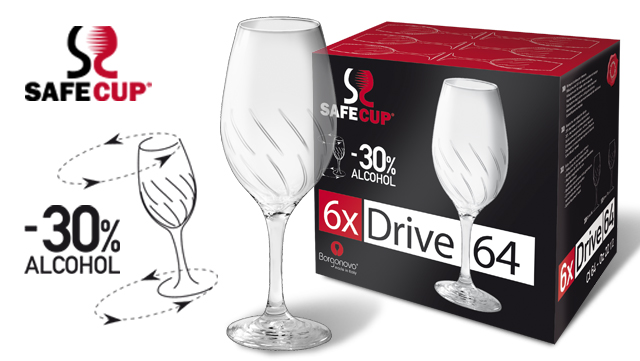
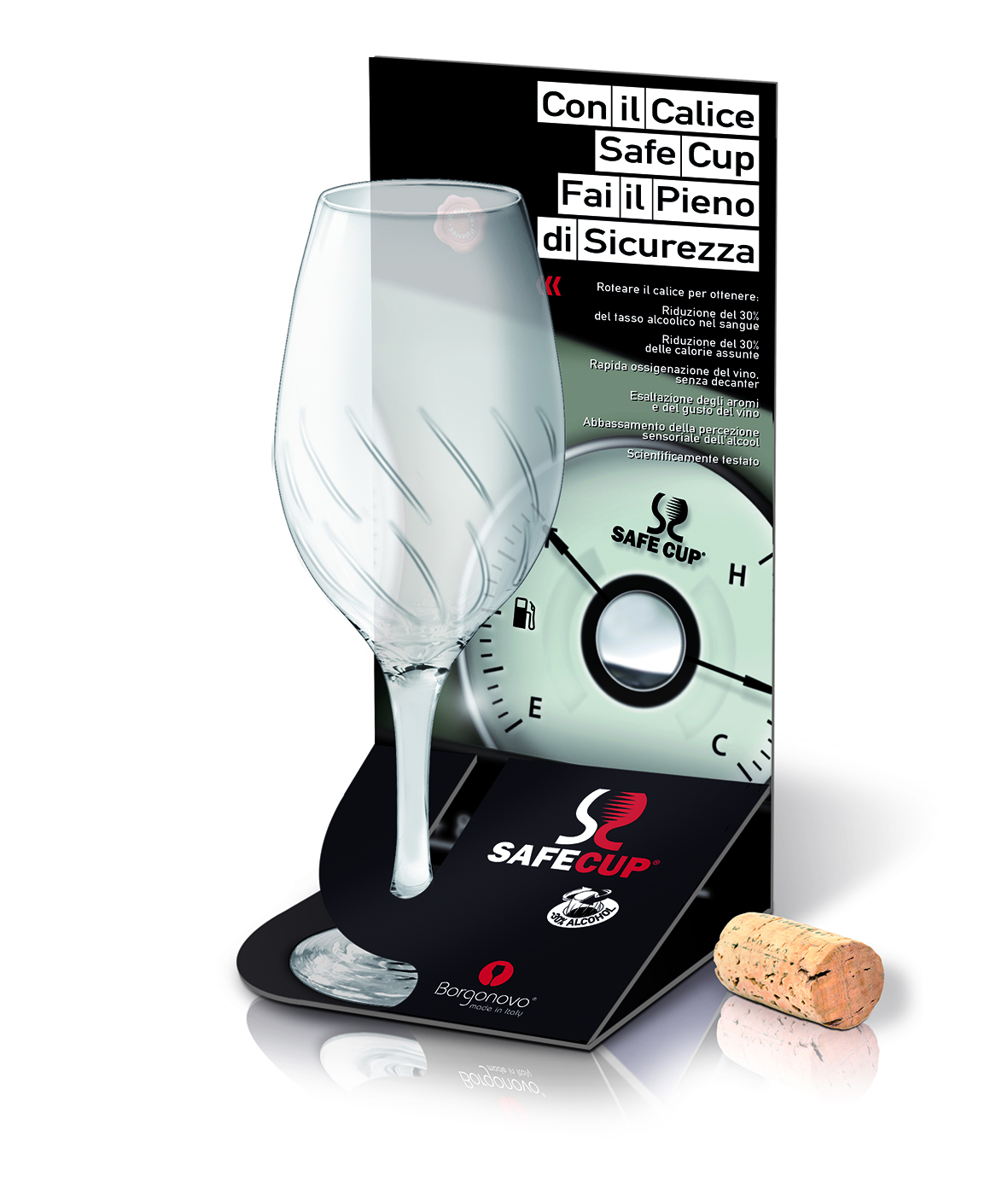
Thanks to special grooves inside the glass, the features of the Safe Cup allow a 30% reduction in the blood alcohol content and the calories absorbed, allowing rapid oxygenation of the wine. The project was the subject of an in-depth study accredited by the “La Sapienza” University of Rome. These clear distinctive elements – the basis of the Safe Cup patent – certainly offered an excellent starting point to work with.
But if on one hand it was easy to identify the differentiating aspects – they were in the nature of the product – on the other the risk was to focus on purely technical, important, but not very useful features if not adequately exploited to meet specific needs and demands of the consumer.
What can this glass do for me? And how is it different from the others?
These are the concepts that the graphic design of its package should communicate in a unique and instantaneous way.
For this reason if we were only limited to technical aspects – it is instinctive when the product has such special characteristics – it would have been a big mistake.
How we decided to proceed:
NAMING
With the choice of the name “Safe Cup” we wanted to create a clear connection with the world of Formula One by recalling the concept of Safety Car.
The goal was to attribute a concept of safety and reliability to the glass. Safe Cup => safe cup => reliable cup.
LOGO
The work done on the logo aims to recall the glass and the grooves that distinguish it by using an “S” that referred to its name “Safe”.
DESIGN
In the design of the package the choice was:
→ focusing the attention on the differentiating aspect that responds more decisively to a consumer need (to reduce the alcohol content in the blood). We did it using the pictogram “-30% Alcohol”
→ communicating the practical use of the glass thanks to the design of the glass that illustrates the rotation with arrows
→ emphasizing the glass itself, communicating its design and making the grooves visible (characteristic and differentiating aspects)
→ reconnecting to the parallelism with the Formula One exploited in the naming, using the contrast of red and black colors, characteristic of the world of engines and also the colors of the Vetreria di Borgonovo company.
Clearly communicating the benefits of the product (what this glass can do for you), providing the elements to understand its use and creating a useful analogy to recall the concept of “driving safety” are the aspects that have guided the realization of this project so innovative.
Giving priority to the consumer’s perception was the key to creating a functional design to sell to the consumer and to the store buyer.
The concepts highlighted on the package (reduction of alcohol in the blood => driving safety) have been deliberately recalled through on a dedicated advertising campaign and through the creation of dedicated exhibitors. In this way the communication efforts have been optimized to always emphasize the concept of security and creating an analogy with driving safety.
This is the process that allowed the Safe Cup line to underline the merits of the product, but above all the benefits for the consumer, the packaging was the tool used to convey the message.
In 1996 enters in the world of marketing, in 1999 founded Ardigia Marketing Funzionale (Ardigia Functional Marketing), in 2013 founded Packaging in Italy, Design Agency for Packaging Positioning™