
Working on the redesign of an existing packaging is not easy: it requires more work (first) and it is easily exposed to comparisons and criticism (after).
In fact, it means working on a product already known by purchasing departments, professionals and consumers.
Understanding how it is perceived is our starting point and this is an issue on which we invest a lot. If we do not understand we do not move!
Our mission?
Changing the existing perception for the better without making troubles.
An example of trouble?
Putting our hand on the one thing that did NOT need a change.
Does it happen?
Take a look at the shelves, products, Nielsen data and agencies making mistakes client after client.
The desire to overdo easily leads to lose sight of the reason why we have to put our hands on an existing packaging: improving its ranking on the shelf to increase sales.
Now you understand why many agencies do not like redesigning.
We like it! It is the best opportunity to get a clear and direct comparison between the new and the old.
“Without our work. ⇢ With our work. ⇢ Here you have the numbers. “
To make you understand better, today, I want to describe a case study that made us get involved with the packaging redesign of a product in the pharmaceutical industry.
This is a not an easy industry to work with, as it deals with a constant increase of items per category and has an exhibition space (the pharmacy) that remains unchanged.
Results?
Purchasing departments do well their job and if consumers do not make the product fall from the shelf, they solve by eliminating the item.
Then, on packaging, you place lots of expectations. Only a functional packaging can save the product in similar contexts.
In fact, if the drug can count on other dynamics to survive (the pharmacist’s advice or a doctor’s prescription), OTC products fight to get noticed and preferred by the consumer and the battle takes place on the shelf.
Working in the pharmaceutical market means reconsidering the entire context in which the product is sold. We are not in supermarkets and guidelines that govern the study of the packaging are moving on a different shelf: light, layout and distance from the end consumer, just to name a few parameters that have nothing to do with supermarket aisles.
The lights of the pharmacy are colder and we need a pre-test, with a mock-up, directly on the shelf to better understand the final result.
We did so when redesigning Medel and obtained valuable information from the test that we could not get any other way.
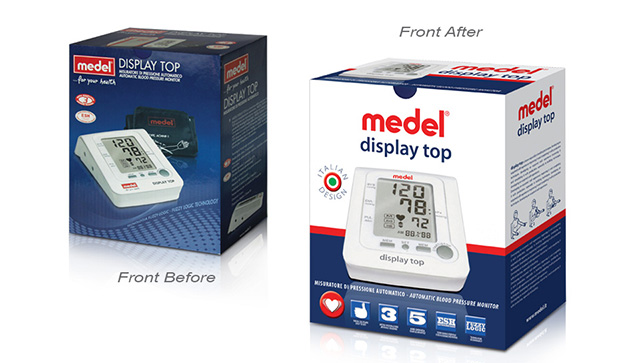
From the point of view of colors, inside the store, we notice a predominance of white that distinguishes all products.
Message and communication tone require particular attention: safety, simplicity and elegance should always be present as a common denominator.
In addition, the ability to convey trust, important in any industry sector, requires maximum attention when working in the pharmaceutical sector: the consumer should be reassured and this is what has to be communicated through packaging.
When we sat in the meeting room to organize the project, we approached existing packaging with a detailed analysis in order to understand what the point of departure was.
A competition analysis allowed us then to identify the landmarks of that specific market.
Obviously, the characteristics of the product were subject of study so we could obtain a pattern of characterizing and distinguishing concepts.
When we solved the above-mentioned points, we began working on the new packaging to emphasize and recall the product positioning in the store.
We decided to focus on a message capable of emphasizing very strongly both technology and research concepts (characterizing and distinguishing elements), trying to convey the functionality of the product and its use after purchase, thus responding to customer’s implicit question “what can this product do for me?”.
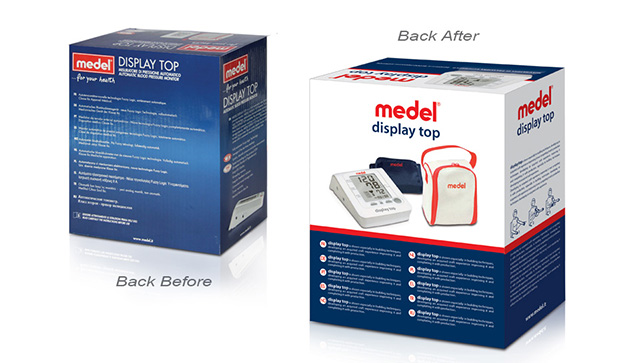
To facilitate the understanding of the message, we used pictograms on the front of the pack that could synthesize and make comprehensible, at first sight, some key elements of the product.
This actually benefits both the consumer and the pharmacist, who working with a very wide list of products could easily identify key features without opening or turning the box (the comparison with the old packaging makes clear the communication difference in this sense). The result is visible in these images that show before and after.
Renovating the existing packaging was not a simple embellishment of the previous work, but a precise and targeted work to reposition Medel’s image inside the store, bringing the product closer to consumers and making sure that this item would also survive the most demanding purchasing departments.
Surviving today means to win the battle to stay alive, on the shelves, selling. Without getting lost with too much theory, the reality is that the box that surrounds your product plays a key role during the decisive buying instant “Do I buy or not?” And this happens in supermarkets, luxury products, frozen goods or pharmacies as we have seen today with a concrete example!
In 1996 enters in the world of marketing, in 1999 founded Ardigia Marketing Funzionale (Ardigia Functional Marketing), in 2013 founded Packaging in Italy, Design Agency for Packaging Positioning™
Franca
Ottimo articolo!
Michele Bondani
Grazie Franca, a presto per un nuovo articolo.
massimo
Bravo Michele,
estremamente interessante!!!
giorgia
Ciao! Vorrei solo dire un grazie enorme per le informazioni che avete condiviso in questo blog! Di sicuro continuero’ a seguirvi|
gaia
Non mi capita mai di fare commenti sui blog che leggo, ma in questo caso faccio un’eccezione, perche’ il blog merita davvero e voglio scriverlo a chiare lettere.